The Rule of Thirds. 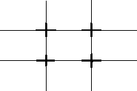 One of the most popular 'rules' in photography is the Rule Of Thirds. It works like this:
Imaginary lines are drawn dividing the image into thirds both horizontally and vertically. You place important elements of your composition where these lines intersect.
One of the most popular 'rules' in photography is the Rule Of Thirds. It works like this:Imaginary lines are drawn dividing the image into thirds both horizontally and vertically. You place important elements of your composition where these lines intersect.
As well as using the intersections you can arrange areas into bands occupying a third or place things along the imaginary lines. Good places to put things; third of the way up, third of the way in from the left.

The Diagonal Method
The 35 mm photographic frame is a rectangle with a ratio of 2:3. Within this rectangle you can draw two squares that overlap each other.
Using the Rule of Thirds and Diagonal method helps produce nicely balanced pictures.
Once you have got the hang of the Rule of Thirds you may want to break it. This is fine. These 'rules' are best used as guidelines.

Important compositional elements to think about beyond thirds:
- What lines are being drawn- converging or dissecting?
- Diagonal lines can also be utilized in a similar way or in conjunction with the rule of thirds
- What basic shapes are being made by your image? Geometric forms can and should be balanced in some way.
- Light and Shadow- these should be balanced in some way they will make a major impact on the overall composition.
- When you slit your eyes before making an image, try to see what basic shapes or shadows are visible.
- Eye movement is directed around your image by the use of different compositional elements.
------------------------------------------------------------------------------------------------------------------------------
The Final Print
In evaluating the quality of your print consider these factors:
Contrast refers to the difference between highlights and shadows. High contrast prints have mostly dark shadows and light highlights. While low contrast prints are mostly grey with few solid blacks or whites. In general a good print should have both a true black and true white, and a range of grey scale or tones in between. Both extremes of light and dark should retain some detail. Shadow detail is how we refer to the information in the dark areas. If a print has too much white, with no information it is referred to as being hot, or blown out.
Variable contrast papers produce prints of different contrast when exposed through different filters in the enlarger. There is a scale of filters which traditionally start at #00 and range through #5.
A #2 filter works similarly to printing with white light (no filter), and represents average contrast for the negative and range of paper. Start using this filter as a control, much as you would with f8 for 8 seconds.
As the number decreases from your control filter #2 the contrast decreases, alternatively as the number
increases the contrast increases.
A # 5 filter increases contrast and produces a print that has more contrast than a print from a non-filtered negative.
For printing with a colour enlarger handle filtration through CYM channels. We will not be touching the C (Cyan) channel. Variations of Y (yellow) and M (magenta) work to achieve the same affect as using a set of filters.
The yellow channel works to decrease contrast while the magenta channel increases contrast. A control starting point as with a #2 filter: C 0 Y 0 M 35
To increase contrast as with a filter valued more than #2 increase M. decrease contrast as with a filter valued less than #2 set M 0 and adjust Y.
( *insert enlarger scale here *)
When changing contrast with filters of any variety print exposure time will change.
As the number increases the density of the filter increases, thus resulting in longer exposure times.
When beginnging a print it is important to start with a #2 filter. Though the filter should not affect your initial contrast, the exposure time will be longer to produce the same print with white light.

In evaluating the quality of your print consider these factors:
Brightness
Contrast
Burning and Dodging
Brightness. Print exposure determines the overall brightness of a print. Too much exposure results in a print that is too dark. Too little exposure results in a print that is too light. Once brightness is determined it is time to evaluate contrast. |
| The left is too flat, the right too dark. To make a decent print from this negative, assuming this was made with a #2 filter; increase the contrast/ filter grade from a #2 to a #3 or #3.5 filter. A new test strip would need to be made to determine the new correct exposure time. |
Variable contrast papers produce prints of different contrast when exposed through different filters in the enlarger. There is a scale of filters which traditionally start at #00 and range through #5.
A #2 filter works similarly to printing with white light (no filter), and represents average contrast for the negative and range of paper. Start using this filter as a control, much as you would with f8 for 8 seconds.
As the number decreases from your control filter #2 the contrast decreases, alternatively as the number
increases the contrast increases.
A # 5 filter increases contrast and produces a print that has more contrast than a print from a non-filtered negative.
A #00 filter reduces contrast and produces a print that is flatter than a print made from a non-filtered negative(less contrast).
* This system works for black and white enlargers, or enlargers without proper colour head filters.

The yellow channel works to decrease contrast while the magenta channel increases contrast. A control starting point as with a #2 filter: C 0 Y 0 M 35
To increase contrast as with a filter valued more than #2 increase M. decrease contrast as with a filter valued less than #2 set M 0 and adjust Y.
( *insert enlarger scale here *)
When changing contrast with filters of any variety print exposure time will change.
As the number increases the density of the filter increases, thus resulting in longer exposure times.
When beginnging a print it is important to start with a #2 filter. Though the filter should not affect your initial contrast, the exposure time will be longer to produce the same print with white light.
No comments:
Post a Comment